Pivot tables are one of the most powerful tools in Microsoft Excel, allowing you to summarize, analyze, and visualize large datasets with ease. If you’re looking to master data analysis in Excel, learning how to create pivot tables is a game-changer. This Excel pivot table tutorial will walk you through the process step by step, making it accessible for beginners while offering insights for intermediate users. Whether you’re handling sales data, financial reports, or survey results, pivot tables can transform raw numbers into actionable insights. By the end, you’ll have practical pivot table examples and Excel tips for beginners to get started right away.
In this guide, we’ll cover everything from preparing your data to advanced customization. Let’s dive in and unlock the full potential of pivot tables in Excel for data analysis.
What Are Pivot Tables and Why Use Them for Data Analysis?
Before we jump into the how-to, it’s essential to understand what pivot tables are. A pivot table is an interactive summary tool in Excel that lets you reorganize and summarize selected columns and rows from a dataset. Unlike static charts or formulas, pivot tables enable you to dynamically “pivot” or rotate your data, revealing patterns, trends, and outliers without altering the source.
For data analysis in Excel, pivot tables excel because they efficiently handle massive amounts of information. Imagine sifting through thousands of rows of sales data; pivot tables can quickly show totals by region, product, or month. They’re especially useful for beginners because they require no complex coding or advanced formulas; just drag-and-drop simplicity.
Key benefits include:
1. Speed: Summarize data in seconds.
2. Flexibility: Change views on the fly (e.g., switch from sums to averages).
3. Visualization: Easily add charts for better insights.
4. Error Reduction: Avoid manual calculations that lead to mistakes.
If you’re new to Excel tips for beginners, start by thinking of pivot tables as your personal data detective-they help uncover stories hidden in your spreadsheets.
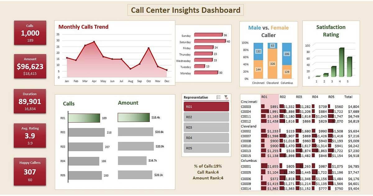
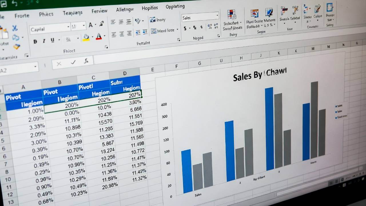
This one shows a clean, step-by-step visual flow of raw data → pivot table creation → summarized result (very infographic-like).
Source: https://tinyurl.com/57tf63ew
A nice before-and-after style diagram showing the raw source data on the left transforming into the summarized pivot table output on the right.
Source: https://tinyurl.com/ckc72feu
Preparing Your Data for Pivot Tables
The foundation of effective pivot tables in Excel for data analysis is clean, well-organized data. Poorly structured data can lead to errors or incomplete results, so take a few minutes to prep.
First, ensure your dataset is in a tabular format:
– Each column should have a clear header (e.g., “Date”, “Product”, “Sales Amount”, “Region”).
– No blank rows or columns in the middle of your data.
– Consistent data types (e.g., all dates in the same format).
Excel tips for beginners: Use Excel’s “Format as Table” feature (under the Home tab) to automatically structure your data. This makes it easier for pivot tables to recognize ranges.
Steps to clean your data:
1. Remove duplicates: Go to Data > Remove Duplicates.
2. Fill in blanks: Use Find & Replace or formulas like =IF(ISBLANK(A2), “N/A”, A2).
3. Convert to proper formats: Ensure numbers are numeric, dates are date-formatted.
Once prepped, your data is ready for analysis. For example, if you’re analyzing sales data, a clean table might include columns for Date, Product Category, Quantity Sold, and Revenue.

Step-by-Step Excel Pivot Table Tutorial
Now, let’s get hands-on with creating pivot tables. This section provides a detailed walkthrough, perfect for those searching for an Excel pivot table tutorial.
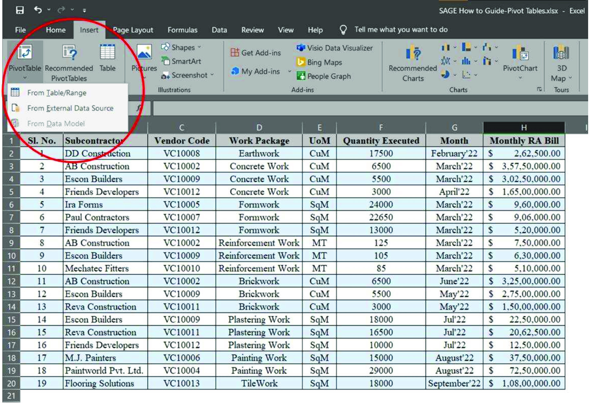
Step 1: Select Your Data Range
Open your Excel workbook and click anywhere in your dataset. Go to the Insert tab and select “PivotTable.” Excel will automatically detect the range (e.g., A1:D1000). If not, manually select it.
For larger datasets, consider using Excel’s Data Model or Power Query for more advanced data analysis in Excel.
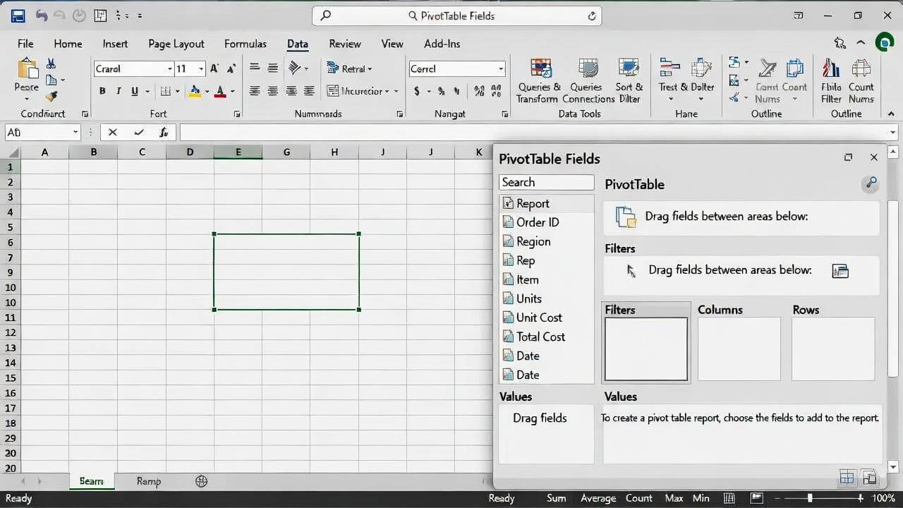
Step 2: Choose Where to Place the Pivot Table
In the Create PivotTable dialog box, decide if you want the pivot table in a new worksheet (recommended for beginners) or an existing one. Click OK, and Excel will generate a blank pivot table framework on the right, with the PivotTable Fields pane open.
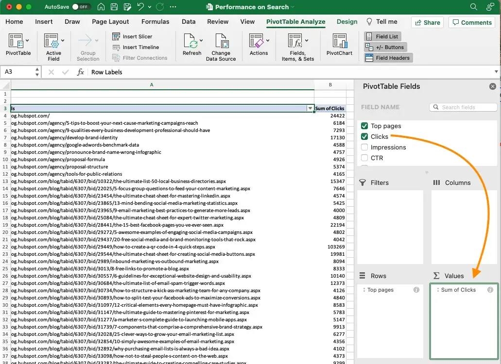
Step 3: Build Your Pivot Table
The magic happens in the PivotTable Fields pane. Drag fields to these areas:
A. Rows: For categories (e.g., drag “Region” here to group by location).
B. Columns: For sub-categories (e.g., “Month” for time-based breakdowns).
C. Values: For calculations (e.g., “Sales Amount” – defaults to Sum, but you can change to Count, Average, etc.).
D. Filters: For top-level filtering (e.g., “Year” to slice data by specific periods).
Excel tip for beginners: Right-click a value field and select “Value Field Settings” to switch from Sum to other functions like Max or Percentage.
Step 4: Customize and Analyze
A. Sort and filter: Click dropdowns in the pivot table to sort ascending/descending or filter items.
B. Group data: Right-click dates or numbers and select “Group” for custom buckets (e.g., group sales into quarters).
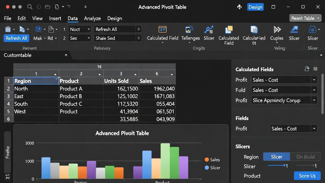
C. Add slicers: Insert > Slicer for visual filters – great for interactive dashboards.
Refresh your pivot table (right-click > Refresh) if your source data changes.
Step 5: Visualize with Pivot Charts
For enhanced data analysis in Excel, turn your pivot table into a chart. Select the pivot table, go to Insert > PivotChart, and choose a type (e.g., bar, pie). The chart updates dynamically as you pivot the data.
This step-by-step process should take less than 5 minutes once you’re familiar with it. Practice with sample data from Microsoft’s templates to build confidence.
Practical Pivot Table Examples for Data Analysis
To make this Excel pivot table tutorial more actionable, let’s explore real-world pivot table examples. These demonstrate how pivot tables in Excel for data analysis can solve everyday problems.
Example 1: Sales Data Analysis
Suppose you have a dataset with 1,000 sales records (columns: Date, Product, Region, Amount). Create a pivot table to summarize total sales by region and product.
– Rows: Region
– Columns: Product
– Values: Sum of Amount
Result: A matrix showing which products perform best in each region. Add a filter for dates to compare year-over-year growth.
Excel tip for beginners: Use conditional formatting (Home > Conditional Formatting) to highlight top performers in green.
Example 2: Survey Response Analysis
For a customer survey with responses (columns: Age Group, Satisfaction Rating, Feedback Category), pivot to count responses by category and average satisfaction.
Rows: Feedback Category
Values: Count of Responses, Average of Rating
This reveals pain points (e.g., low satisfaction in “Customer Service”). Slice by age group for demographic insights.
Example 3: Inventory Tracking
Track stock levels (columns: Item, Warehouse, Quantity, Date). Pivot to sum quantity by item and warehouse, then group dates by month for trend analysis.
Add a calculated field (PivotTable Analyze > Fields, Items & Sets > Calculated Field) for reorder alerts, like =IF(Quantity<50, “Reorder”, “OK”).
These pivot table examples show versatility—from business metrics to personal finance tracking.
Conclusion: Start Analyzing Your Data Today
Mastering pivot tables in Excel for data analysis opens up a world of possibilities, turning overwhelming data into clear, decision-making tools. With this Excel pivot table tutorial, you’ve got the steps, examples, and tips to get started – whether you’re a beginner crunching personal budgets or an intermediate user optimizing business reports.
Don’t let your data sit idle. Open Excel now, import a sample dataset, and create your first pivot table. Experiment with the examples above, and watch how quickly you uncover insights. If you’re ready to dive deeper, check out our Complete Excel Training Course for more hands-on guidance and exclusive templates.
What are you waiting for? Apply these skills to your next project and elevate your data analysis game today!